This page provides pieces from September 2015 to January 2016, starting from the top as the most recent piece to the bottom as the oldest piece within the time interval given above. In addition, to save you time this page consists of pieces called: “Allegory”, “Stil”, “Strongest Soldier”, “Portraits gallery” Original Logo & Logotype”, “Greeting Cards gallery” and “Geometric Fiction”.
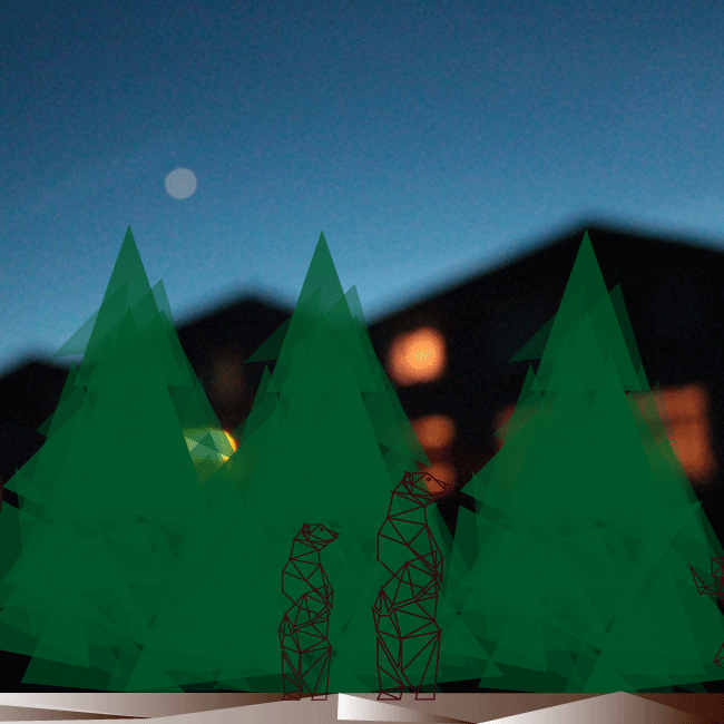
“Geometric Fiction” is a GIF animation created by using softwares, Adobe photoshop CS6 and Adobe Illustrator CS5. The purpose of the assignment is to create a GIF animation using original drawings and/or photographs using photoshop animation techniques. This is my first GIF animation ever made and I enjoyed making it even though it was tricky animating in Adobe Photoshop CS5. Everything was hand-drawn on Adobe Illustrator CS5 and the animation process was completed using puppet warp and tweening. In the brainstorming stage I wanted to create a running man along because it was the most generic animation I could think of when it came to making your first animation. The theme was using geometric graphic and vector techniques to make the piece modern and simplistic. I drew the bears to give the GIF animation a story and the trees were drawn to give the audience a realistic/appropriate environment for the bears – a forest. Elements of designs used in this piece of artwork are, space using atmospheric space with the foreground and background. The second element is line using strokes to thicken the outlines and outlines for the bears and the running man to depict the edge of the shape. The last element is shape using geometric shapes. Now, the principles of design are; emphasis because of its movement it is the focal point of the piece and it has contrast due to the blurred background, movement because the path of the viewers eye takes you through the piece, proportion because there are certain parts of the piece with various size proportion and finally rhythm because there are multiple geometric shapes being used repeatedly throughout the piece. In conclusion, this GIF animation was was a success in my eyes due to the amount of time and difficulty I was given in order to create this art piece.


The purpose of this assignment is to create greeting cards for special occasions with a software called Adobe Illustrator CS6 or Adobe Photoshop CS6. I decided to work with illustrator for two reasons, to better myself with an “alien” software and because I thought it would be more efficient to use a tool near me rather than wait for something to come to me. My greeting cards followed a a specific theme – geometry. Using geometric shapes assisted me a lot when my vision was captured as a modern/simplistic feel. The colour swatches I chose pertained to the specific holiday look. For example, the christmas card contained the colours of green and red and for the birthday card it contains bright and happy colours like orange and yellow. In addition, I added a metallic background design to give my piece a modern appeal. Moreover, one of the instructions were to create typefaces for each that best suit an broad range of people so, I incorporated lines that don’t leave out any group in general. Finally, the incorporation of the elements and the principles of design: Line, the audience follows the lines within the piece, shape, using organic shapes. Principles of design: emphasis due to the repetition of shapes overlapping and proportion due to the size increase and decrease shown in shaped displayed.

The purpose of this assignment is to familiarize us with a ”new” software called Adobe Illustrator CS6. As well as, using Adobe Illustrator with our skills that we have learned throughout the unit. My logo and logotype were made for my own personal use, consisting of colors that in my opinion match the logotype to which the colors are shades of garnet and a shade of white. In addition, I added a scratched metal texture to give my piece a vintage appeal. Moreover, one of the instructions were to create and place a logotype so that is almost/exactly represent the design so, that the viewer/audience becomes drawn to it. And in my own opinion I did just that. Thirdly, my logo design itself pertains to filming and so, the design is a camera lens with a reflection of my logo to make the viewer/audience notice the correlation between the film logo and the camera lens. Finally, the incorporation of the elements and the principles of design: Value from the shade of white then converted to less opaque giving the effect of the lens reflection, balance of the colors, lines are seen in the typeface, harmony is also seen in the logotype in accordance to the way the lines move to a soothing appeal. In conclusion, this assignment was a difficult one because to the software was not user-friendly and at times frustrating. However, finishing the creation of my personal logo and logotype gave me such joy to know that I completed the task they way I wanted to complete the task.

“Strongest Soldier” a 17” by 11” art piece done on Adobe Photoshop CS5. This piece was created to commemorate September the 11th – Remembrance Day. Creating a word bubble and filling up the word bubble with meaningful phrases that make you think for a second and then finding a highly detailed photo that evokes true emotion made this finishing art piece quite east to make. In addition, the colours chosen for this project were made to be relevant to the colours in our remembrance poppy. In the end, incorporating these images and texts to make one final piece, they each have a role to be played. For instance , the texts play the role of being the words spoken by the infant in the background in order to get a younger (age-wise) and sadder point of view. Another role being played in this art piece is the background photo, the infant. The infant was placed in my piece because it was meant to give the viewer/audience the impression of how heartbreaking it is to leave their child behind to go fight in a war. The message of “Strongest Soldier” is that even though there are parents and individuals with families who are willing to fight in war as Canadian “soldiers”, I would like to say that in my point of view the child is the strongest soldier because they have no choice but to give a major and incredible part of their life and having to live on knowing that their mother or father could’ve been there and to me it’s just saddening to think about. Finally, the principles of design I displayed were emphasis and proportion. Emphasis to catch the viewer’s attention in order to make one area stand out by contrasting it with other areas. In addition proportion to get the feeling of unity, to create when all parts (sizes, amounts, or number) relate well with each other. In conclusion, “Strongest Soldier” emphasizes the point of view from the children who are apart of military families. Stay strong!


This photo-shoot is called “Portraits”. All of the photographs in this shoot were captured using Canon EOS Rebel T3i cameras, and they were adjusted using Adobe Photoshop.
In the series of photographs, three prominent compositional techniques are seen; framing, balance and rule of thirds. Framing is found in all three photographs that are in the series, especially the first and the third. In the photographs each show photo context,( giving images a sense of depth and layers in essence framing a shot generally puts something in the foreground which adds an extra dimension to the shot). This technique is a very visually appealing way to create a focal point in a piece. Sometimes it’s what you can’t see in an image that draws you into it as much as (if not more than) what you can see in the picture. The second compositional technique is called balance and is found in the second photograph. Balance is the basis of every composition; it determines whether the photo is pleasing and harmonious or uncomfortable and unresolved to look at. Take balance in its literal sense and the analogy of weighing scales comes to mind. Each image integrated in this final piece weigh an equal role in order to balance this piece. The third and final compositional technique is using the rule of thirds. That being said, it is an extremely effective way to position the focal point of a photograph in such a way so that the viewer is naturally drawn the it without the focus being in the direct center of the page, especially the first and the third final pieces. In this case, while looking at the first final piece the subject is positioned at the right side of the photograph where the right grid line would be. His head/neck area is also strategically positioned at the intersection where the upper right intersection would occur, drawing more attention to this area.
The main reason I called this art piece “Portraits” is because a portrait is photography of a person or group of people that displays the expression, personality, and mood of the subject. Like other types of portraiture, the focus of the photograph is usually the person’s face, although the entire body and the background or context may be included. That being said, this is what I believe I did – a capturing of expression, personality, and mood of the subject.
My inspiration for this photo-shoot was the wonderful Andy bell. His amazing talent in the fields of photography and videography continue to inspire me on a day-to-day basis and allow me to challenge myself to become a better artist.

This photo-shoot is called “Portraits”. All of the photographs in this shoot were captured using Canon EOS Rebel T3i cameras, and they were adjusted using Adobe Photoshop.
“Stil” my idea towards Conceptual image, an assignment to form a philosophical theme into one image. This art piece was made in 4 easy steps: take photos of a subject using timer setting, mask them to make the sub images real, adjust the brightness and contrast to get a harmonious sun feel and add textures make emotions fly for example I used a rain texture to give the flatten image a sadden/sombre aesthetic. Each image fall under the theme of time: the photo with the half naked man symbolizes the primitive being we once were, the second yet clothed man represents the man we are now and the camera is to show that I captured time lapse/stil in one take. The message behind my work is to illustrate how far humanity has come from archaic to adult. Finally the elements of design that I had incorporated were; line, shape, and colour. line because of the contour lines, shape from the organic shapes, manipulating the hue and saturation.

Allegory is a 17” x 11” art piece done on the software Adobe Photoshop CS6. This assignment was to create a personal piece of artwork involving images of our lives influenced by unknown. This piece was created by montaging a variety of images using masking and adjustment layer techniques. As you can see it showcases a theme of family, each image has a back story to my life and how it ties to my family which is very important to me. Proportion, balance and emphasis are being used in this piece. Proportion refers to the relationships of the size of objects in a body of work, Balance to distribute the visual weight of objects, colours, texture, and space. And emphasis to catch the viewer’s attention towards the centre, the most important thing to me. In conclusion, a very exciting piece to work on with myself, to me it was a challenge to think of images/photos to put in this piece after deciding a family theme.
Thanks for viewing this page!
